
Accessibility Color Contrast Checker Online
Free online color contrast checker tool to test accessibility compliance. Check if your text and background colors meet WCAG AA and AAA standards. Get instant contrast ratios and accessibility recommendations.
Color Input
Quick Colors:
Quick Colors:
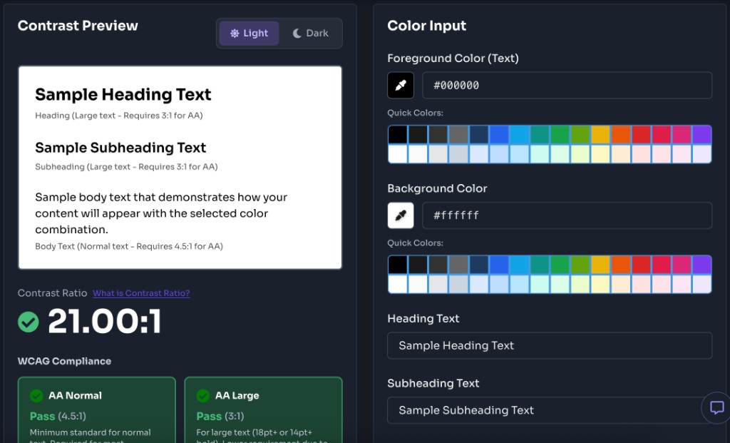
Contrast Preview
Sample Heading Text
Heading (Large text - Requires 3:1 for AA)
Sample Subheading Text
Subheading (Large text - Requires 3:1 for AA)
Sample body text that demonstrates how your content will appear with the selected color combination.
Body Text (Normal text - Requires 4.5:1 for AA)
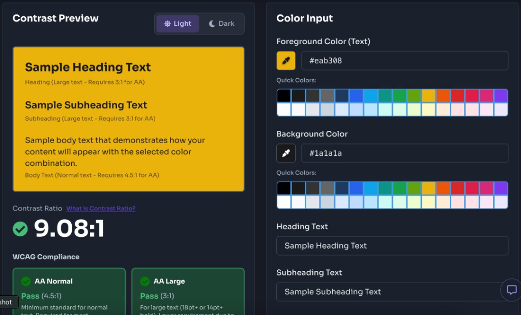
Contrast Ratio
21.00:1
WCAG Compliance
AA Normal
Pass
(4.5:1)
Minimum standard for normal text. Required for most websites.
AA Large
Pass
(3:1)
For large text (18pt+ or 14pt+ bold). Lower requirement due to size.
AAA Normal
Pass
(7:1)
Enhanced standard for normal text. Better for visual impairments.
AAA Large
Pass
(4.5:1)
Enhanced standard for large text. Optimal accessibility level.
What is Color Contrast?
Color contrast refers to the difference in luminance (brightness) between two colors. It's a critical aspect of web accessibility that determines how easily users can distinguish text from its background. The contrast ratio is calculated using a formula that compares the relative luminance of the foreground (text) and background colors.
The Web Content Accessibility Guidelines (WCAG) define minimum contrast ratios to ensure that text is readable for users with visual impairments, including color blindness and low vision. Higher contrast ratios make text more readable for everyone, not just those with disabilities.
Contrast Ratio Formula:
Contrast Ratio = (L1 + 0.05) / (L2 + 0.05)
Where:
- L1 = Relative luminance of the lighter color
- L2 = Relative luminance of the darker colorHow to use Color Contrast Checker?
Our Color Contrast Checker makes it easy to test your color combinations for accessibility compliance. Follow these simple steps to ensure your designs meet WCAG standards.
Select Your Colors
Use the color pickers or enter hex codes to select your foreground (text) and background colors. You can click the color swatch to open a visual color picker, or type hex codes directly (e.g., #000000 for black or #ffffff for white).
Choose Text Size
Select whether you're testing normal text or large text. Large text is defined as 18pt (24px) or larger regular text, or 14pt (18.5px) or larger bold text. Different WCAG standards apply to different text sizes.
Review Results
Check the contrast ratio and WCAG compliance results. The tool will show you whether your color combination passes WCAG AA (minimum) and AAA (enhanced) standards for both normal and large text. You'll also see a live preview of how your text will appear.
Adjust if Needed
If your color combination doesn't meet the required standards, adjust either the foreground or background color until you achieve compliance. The tool updates in real-time, so you can see results instantly as you make changes.
Top Features of Color Contrast Checker
Our Color Contrast Checker provides a comprehensive set of features to help you create accessible designs that meet WCAG standards.
WCAG AA & AAA Compliance
Instantly check if your color combinations meet WCAG 2.1 Level AA (minimum) and Level AAA (enhanced) standards for both normal and large text. Get clear pass/fail indicators for each compliance level.
Accurate Contrast Ratio
Calculate precise contrast ratios using the WCAG 2.1 formula. See the exact ratio displayed as a number (e.g., 4.5:1) to understand how your colors compare.
Live Preview
See exactly how your text will appear with the selected color combination. The preview updates in real-time as you adjust colors, giving you immediate visual feedback.
Color Picker & Hex Input
Use the visual color picker for easy selection or enter hex codes directly. Both methods are supported, making it convenient for designers and developers alike.
Text Size Support
Test both normal and large text sizes. The tool automatically applies the correct WCAG standards based on your text size selection, ensuring accurate compliance checking.
Free & No Registration
Completely free to use with no registration required. Test as many color combinations as you need without any limitations or hidden fees.
What are the Best Color Contrast combinations?
The strongest color contrast pairs use dark text on light backgrounds for light mode, and light text on dark backgrounds for dark mode. Every combination below meets WCAG AA for normal text (4.5:1 or higher), and most reach AAA (7:1 or higher). Use these palettes as starting points for body copy, headings, buttons, and navigation — then verify your exact shades with the checker above.
Light Mode — Best Combinations
Light mode works best with deep, saturated, or near-black foreground colors on soft white, gray, or tinted pastel backgrounds. Avoid light gray text on white — it is one of the most common accessibility failures on the web.
Classic Monochrome
Sample readable text on this background.
#000000#ffffff21.0:1
WCAG AAA
Best all-purpose pairing for body copy, headings, and UI labels.
Charcoal & Snow
Sample readable text on this background.
#1a1a1a#fafafa16.7:1
WCAG AAA
Softer than pure black on white — great for long-form reading and blogs.
Slate & Mist
Sample readable text on this background.
#334155#f1f5f99.5:1
WCAG AAA
Modern SaaS dashboards, documentation, and product marketing pages.
Navy & White
Sample readable text on this background.
#1e3a5f#ffffff11.5:1
WCAG AAA
Corporate sites, finance apps, and professional landing pages.
Forest & Mint
Sample readable text on this background.
#14532d#f0fdf48.7:1
WCAG AAA
Health, sustainability, and nature-focused brands.
Indigo & Lavender
Sample readable text on this background.
#3730a3#eef2ff8.9:1
WCAG AAA
Tech startups, developer tools, and creative portfolios.
Burgundy & Rose
Sample readable text on this background.
#881337#fff1f28.7:1
WCAG AAA
Editorial content, fashion, and lifestyle blogs.
Warm Stone
Sample readable text on this background.
#44403c#fafaf99.8:1
WCAG AAA
E-commerce product pages, forms, and neutral design systems.
Dark Mode — Best Combinations
Dark mode needs bright foreground colors on deep, desaturated backgrounds. Pure white on pure black gives maximum contrast, but slightly softer pairings — like light gray on charcoal — reduce eye strain while still passing AAA.
Classic Inverted
Sample readable text on this background.
#ffffff#00000021.0:1
WCAG AAA
Maximum contrast dark theme for code editors and media apps.
Soft White & Charcoal
Sample readable text on this background.
#f3f4f6#11182716.1:1
WCAG AAA
Default dark UI for apps like GitHub, Slack, and VS Code.
Light Slate & Midnight
Sample readable text on this background.
#e2e8f0#0f172a14.5:1
WCAG AAA
Developer docs, admin panels, and data-heavy dashboards.
Sky & Deep Blue
Sample readable text on this background.
#bae6fd#17255411.1:1
WCAG AAA
Night-mode productivity tools and cloud service interfaces.
Mint & Forest
Sample readable text on this background.
#a7f3d0#064e3b7.6:1
WCAG AAA
Dark eco-brands, wellness apps, and outdoor product sites.
Pink & Plum
Sample readable text on this background.
#fbcfe8#4c1d957.9:1
WCAG AAA
Creative agencies, design portfolios, and entertainment sites.
Amber & Espresso
Sample readable text on this background.
#fde68a#451a0312.0:1
WCAG AAA
Warm dark themes for food, coffee, and hospitality brands.
Cyan & Teal Dark
Sample readable text on this background.
#a5f3fc#134e4a7.6:1
WCAG AAA
Fintech, analytics, and developer-focused dark interfaces.
Quick palette tips
Light mode: Use #000000–#334155 range for text and #ffffff–#f0fdf4 range for backgrounds. Tinted backgrounds (blue-50, green-50, rose-50) pair well with their darker hue family for branded, accessible designs.
Dark mode: Use #e2e8f0–#ffffff range for text and #0f172a–#111827 range for backgrounds. Accent tints like sky, mint, and amber work on deep colored backgrounds for links, badges, and highlights.
Always test links and buttons separately. A body text pair may pass WCAG, but a colored link on the same background often fails. Check every unique foreground/background combination before shipping.
Frequently Asked Questions - FAQs
What is WCAG and why is color contrast important?
WCAG (Web Content Accessibility Guidelines) is a set of international standards for web accessibility. Color contrast is crucial because it ensures that text is readable for users with visual impairments, including those with color blindness, low vision, or age-related vision changes. Without sufficient contrast, text becomes difficult or impossible to read, excluding many users from accessing your content.
What's the difference between WCAG AA and AAA?
WCAG Level AA is the minimum standard required for most websites and applications. It requires a contrast ratio of at least 4.5:1 for normal text and 3:1 for large text. WCAG Level AAA is the enhanced standard, requiring 7:1 for normal text and 4.5:1 for large text. While AAA provides better accessibility, it can be more challenging to achieve in design. Most organizations aim for AA compliance as a minimum.
What counts as "large text"?
According to WCAG, large text is defined as 18pt (24px) or larger regular text, or 14pt (18.5px) or larger bold text. Large text has lower contrast requirements because it's easier to read. Headings, titles, and emphasized text often qualify as large text if they meet these size requirements.
Do I need to test every color combination on my site?
You should test all unique color combinations used for text and backgrounds on your site. This includes body text, headings, links, buttons, form labels, error messages, and any other text elements. Focus on testing the most common combinations first, especially those used for primary content and interactive elements.
What if my colors don't meet the requirements?
If your colors don't meet WCAG requirements, you have several options: (1) Darken or lighten one of the colors to increase contrast, (2) Use a different color that provides better contrast, (3) Increase the text size if it qualifies as large text, (4) Use bold text if it meets the large text size requirement. The tool updates in real-time, so you can experiment with different colors until you find a combination that works.
Is this tool free to use?
Yes, our Color Contrast Checker is completely free to use. There are no registration requirements, no hidden fees, and no limitations on usage. You can test as many color combinations as you need without any restrictions.
More Tools
Discover more free tools to boost your productivity
Gradient
HEX: #ff5733
RGB: 255, 87, 51
HEX: #4a90e2
RGB: 74, 144, 226
Blog Post
Transform your content...
Social Post
